
Case Studies / Portfolio
My Portfolio
Click on image to enlarge

View more on
Case Studies
Paws at Peace
Helping a calm, caring brand stay beautifully consistent
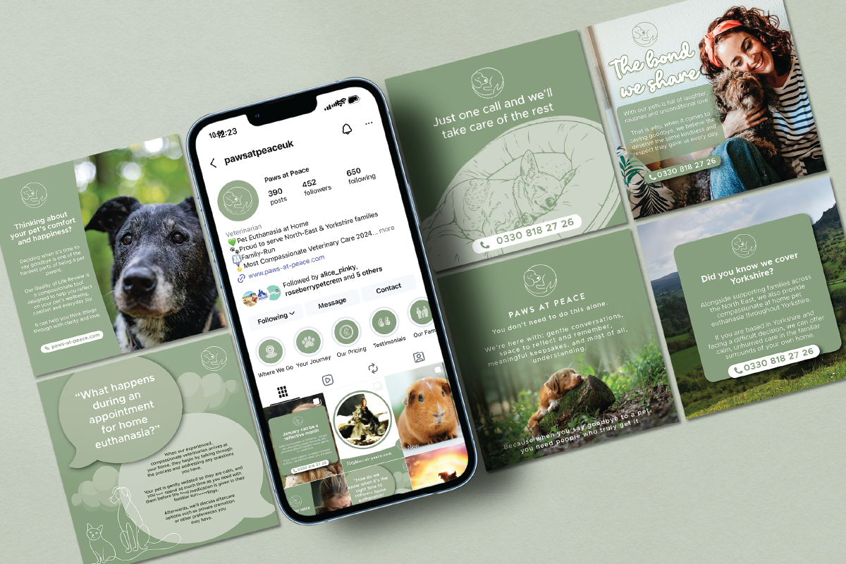
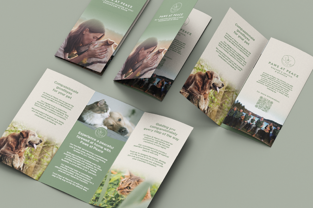
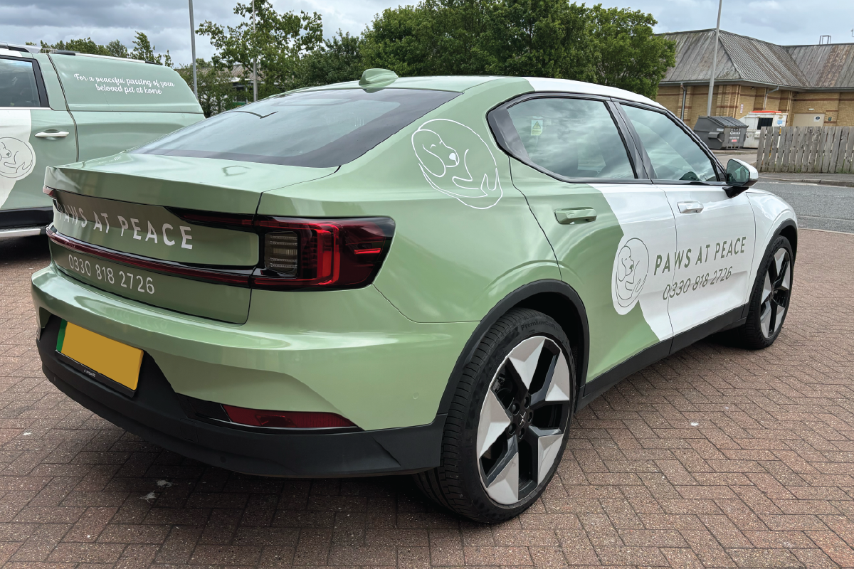
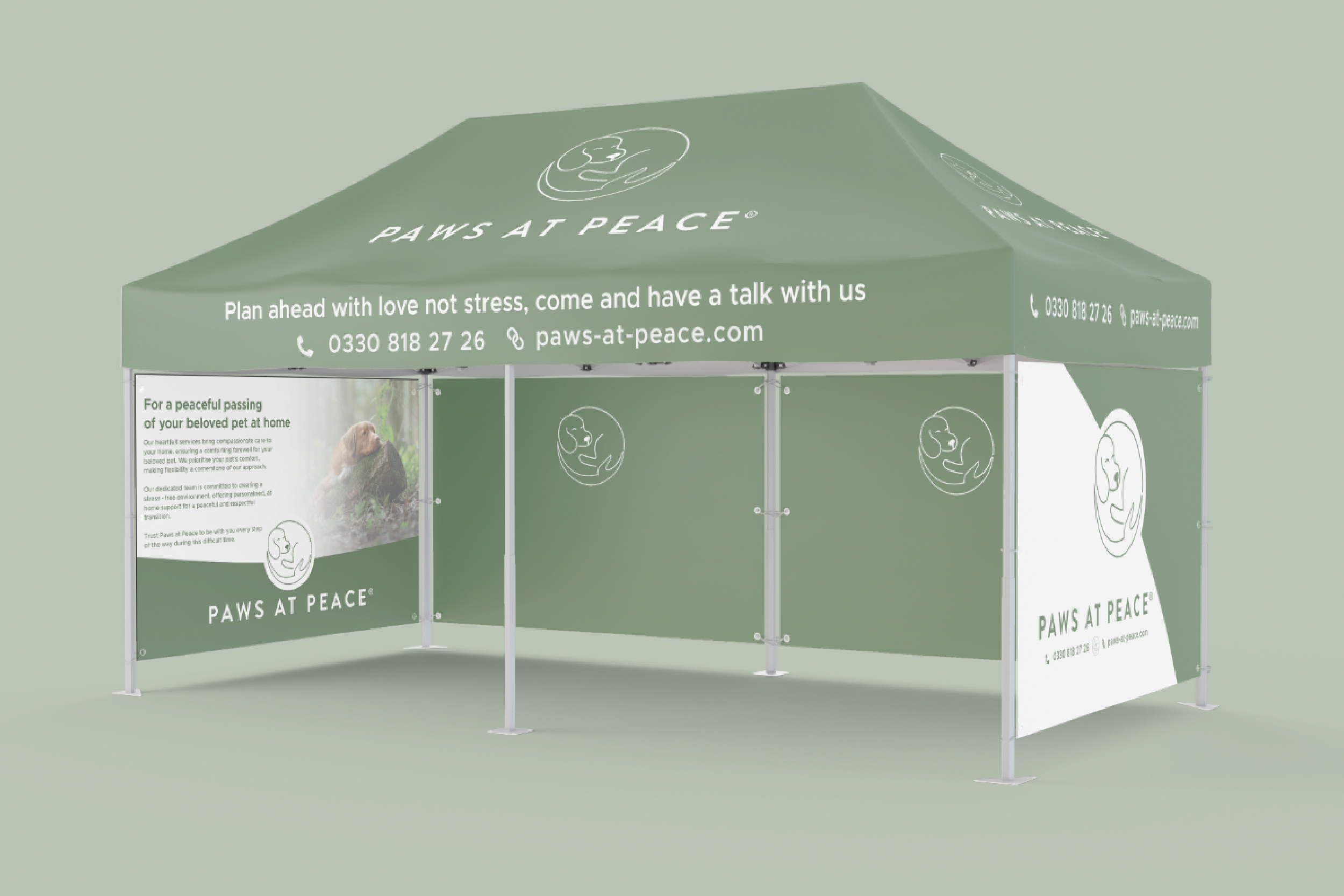
I’ve been working closely with Paws at Peace for a number of years, supporting them as their business has grown and evolved. With their logo and colour palette already in place, my role has been to help their brand stand out while still reflecting the calm, peaceful nature of the service they provide.
Over the years, we’ve worked across a wide range of design projects - from social media content that keeps their messaging clear, consistent and up to date, to printed materials including leaflets, brochures, exhibition stands and vehicle wraps. Everything has been carefully designed to feel professional, reassuring and true to their brand.
A key part of this work has been developing a clear set of branding guidelines, helping Paws at Peace maintain consistency across all of their marketing as the business continues to grow. I’ve worked as an extension of their team, offering ongoing design support whenever it’s needed.
It’s been a real pleasure to work with a business that does such meaningful and compassionate work.
“Having worked with Alice for three years, we can confidently say she is one of the most reliable, prompt and creative graphic designers we’ve encountered. She is consistently delivering exceptional results without needing constant oversight. Alice is easy to communicate with and also highly proactive, constantly contributing fresh ideas that improve our brand. She doesn't just meet expectations, she exceeds them.”
JT Atkinson
Making sure a classic brand looks sharp across every depot
I’ve worked closely with JT Atkinson and their marketing team across a range of projects, supporting their brand across multiple depots throughout the North of England.
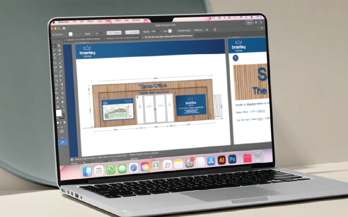
A large part of our work together has focused on showroom signage, including both directional and promotional signage. This has involved understanding site surveys, suggesting signage solutions to suit each space, and setting artwork up correctly for production - ensuring everything works just as well in real life as it does on screen.
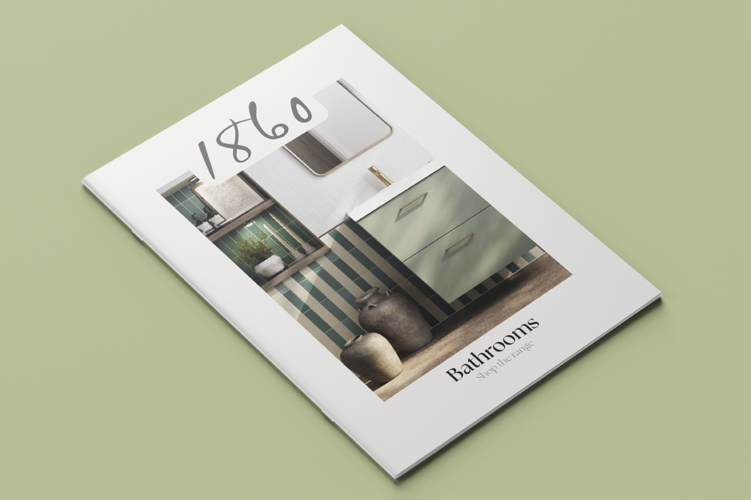
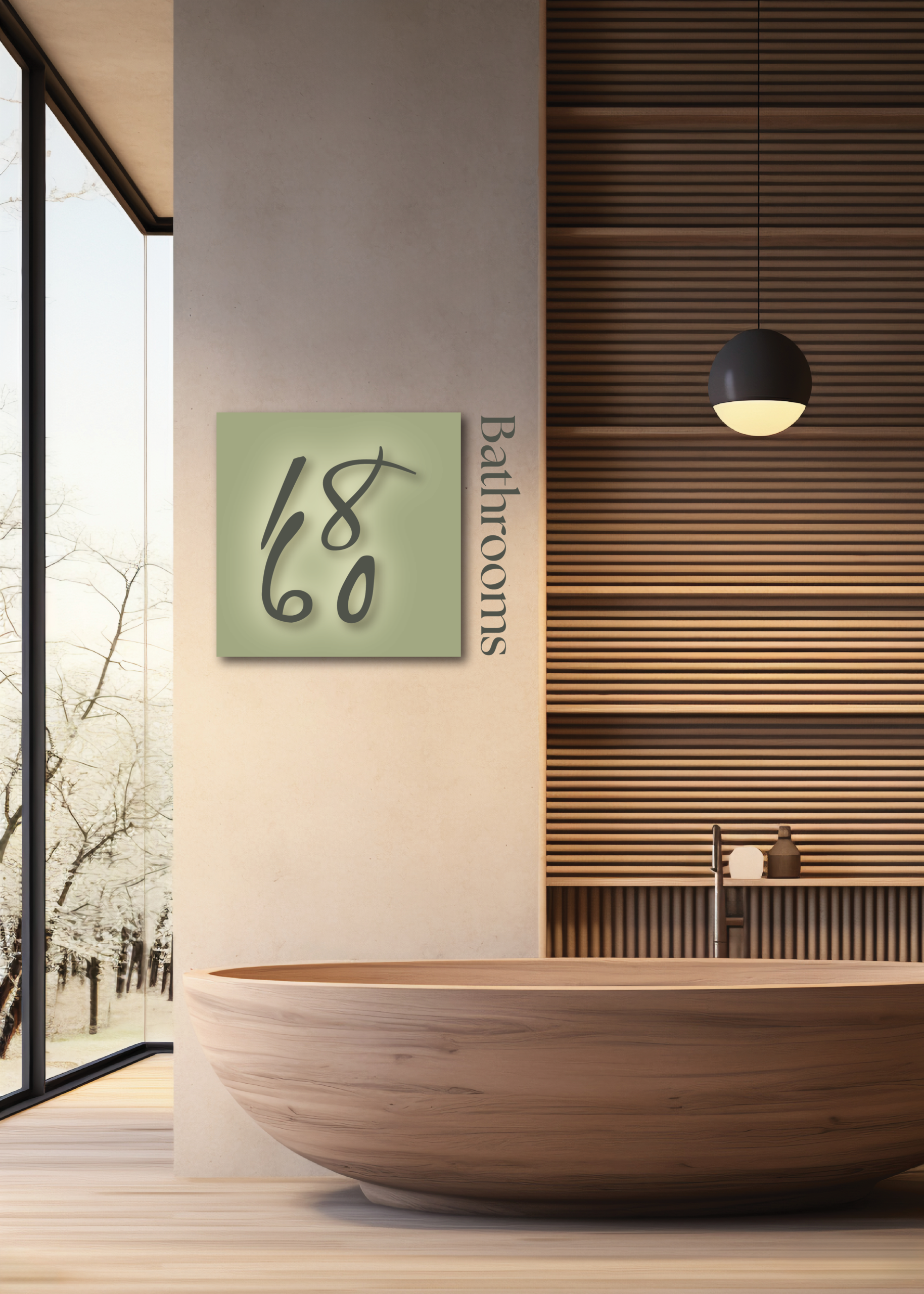
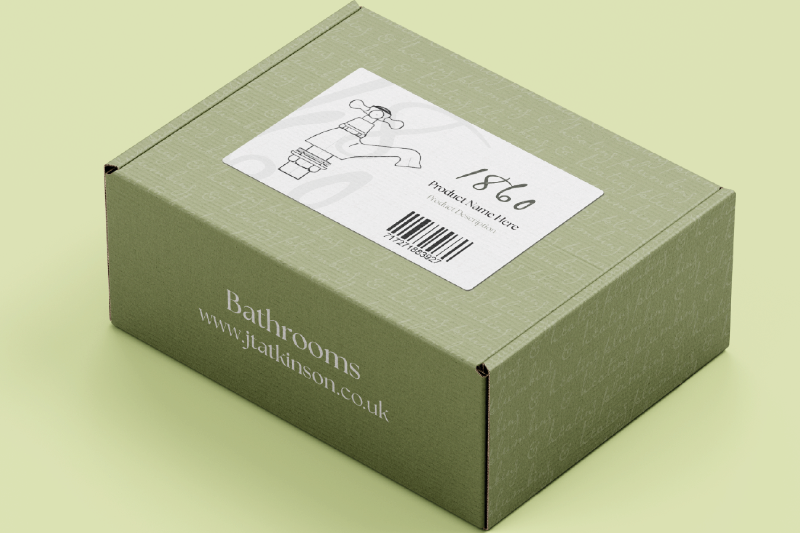
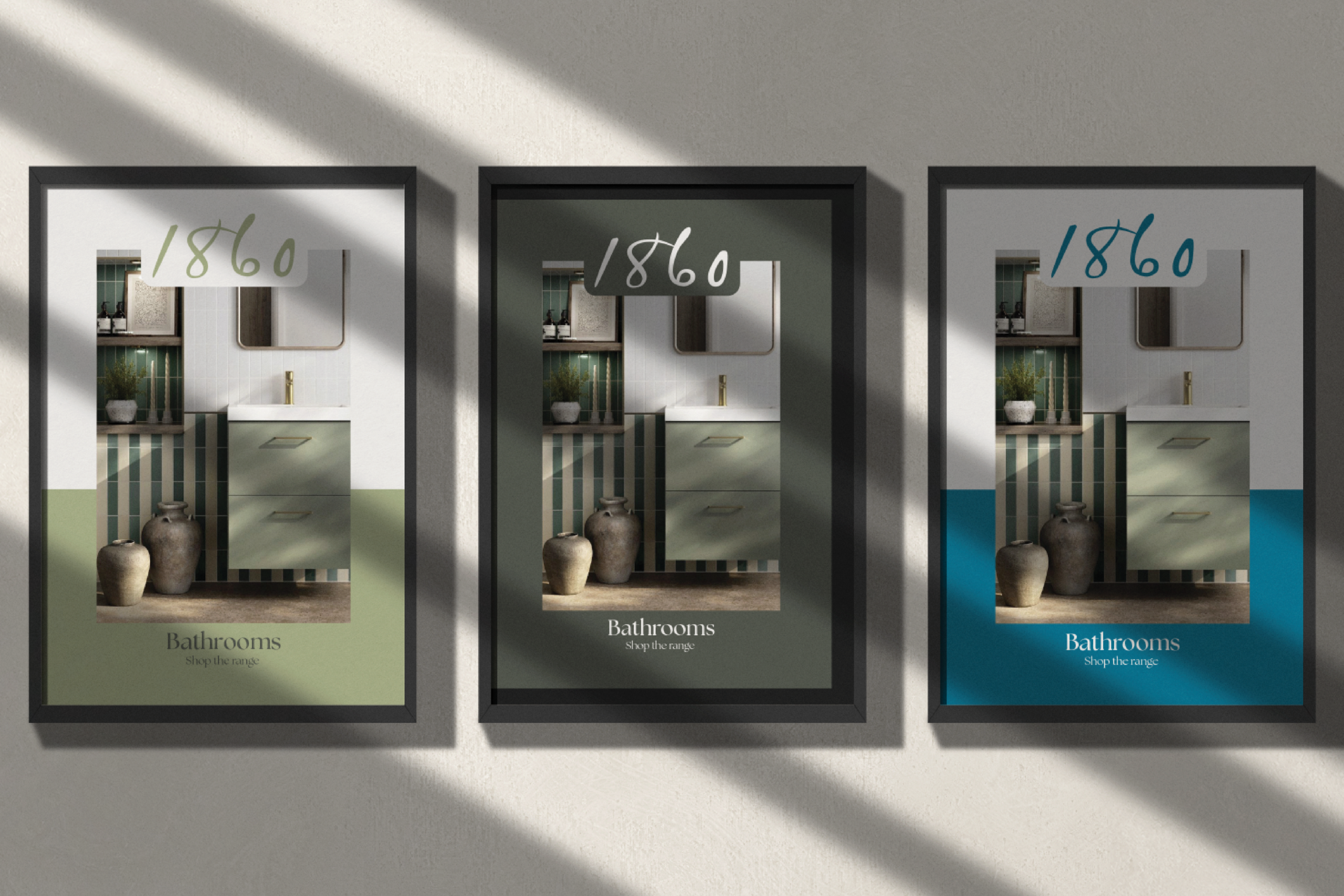
Alongside this, I’ve been involved in the development of a sub-brand for JT Atkinson, 1860. This higher-end brand has been created for their premium bathrooms and kitchens, with the name paying tribute to the company’s roots, having been founded in 1860. The aim has been to create a more refined look and feel, while still sitting comfortably within the wider JT Atkinson brand.
Working across both their core brand and sub-brand has been a great example of collaborative design, balancing consistency with evolution.
“We’ve been working with Alice at Pink Designs for over a year, and she has been absolutely brilliant. Alice has supported us across signage design, branding, and a wide range of ad hoc design work, consistently delivering high-quality results.
She is quick, professional, and incredibly easy to work with. Her understanding of our brand and ability to turn ideas around with minimal amends makes her feel like a true extension of our team. We wouldn’t hesitate to recommend Alice to anyone looking for a reliable, talented graphic design service.”
Dinkies Swim School
Making waves with a splashy, fun vehicle design
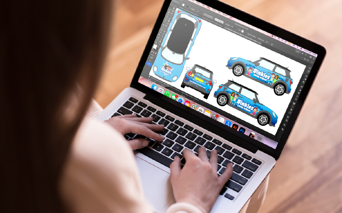
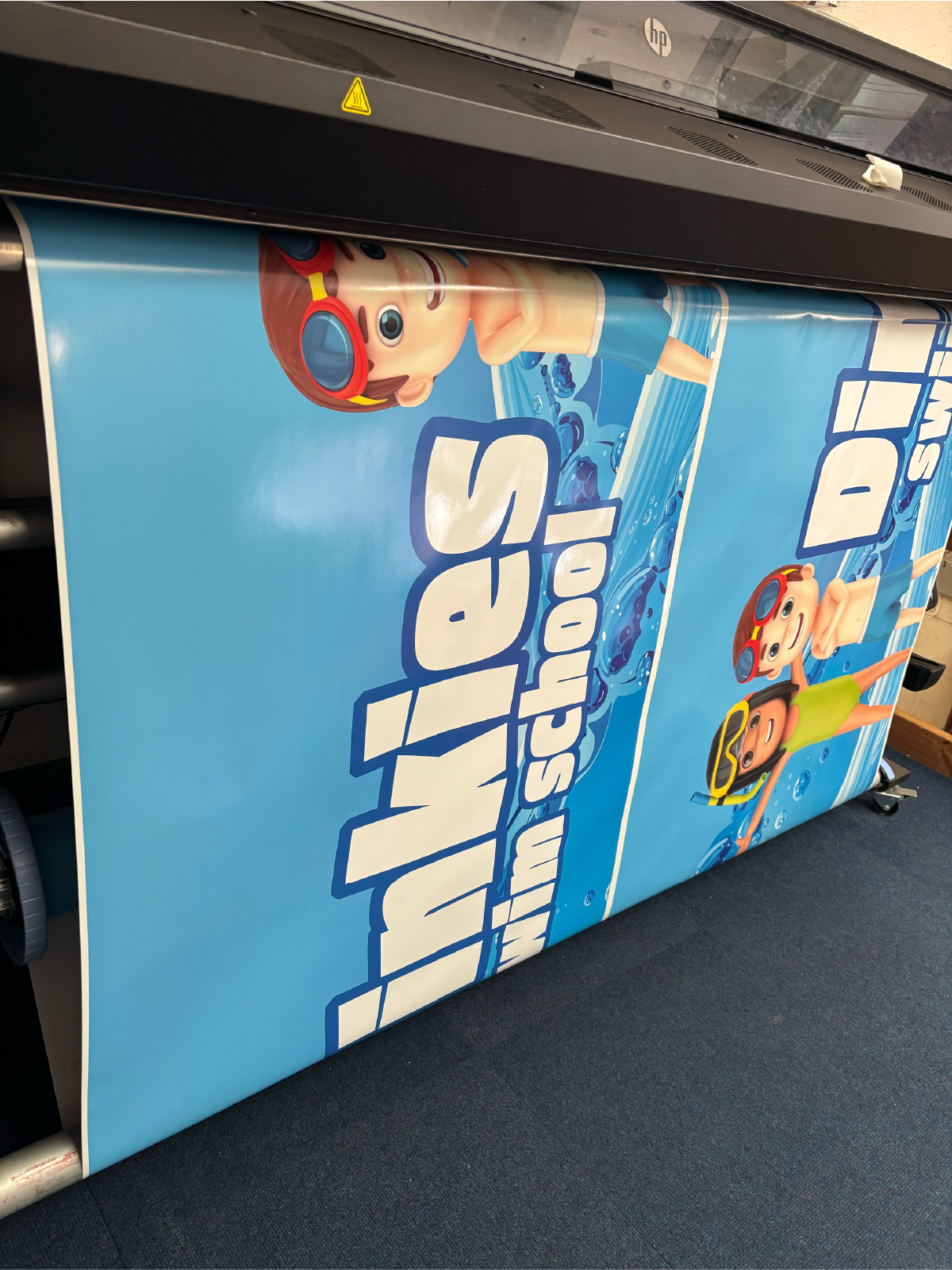
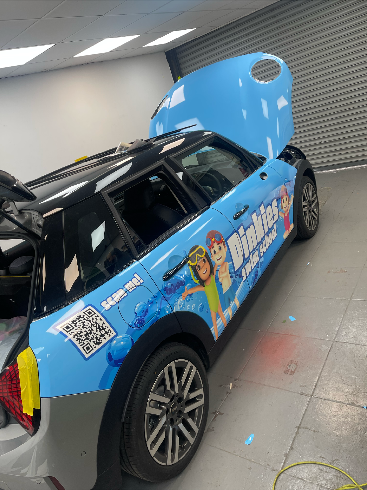
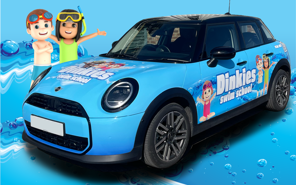
I worked with Dinkie’s Swim School to design a vehicle wrap that would really stand out on the road.
As an independent children’s swim school, it was important that the design felt bright, fun and eye-catching — while still clearly representing their brand.
Using their existing branding as a starting point, I incorporated the cartoon child characters to add personality and movement to the design. The bold blue colour was chosen to instantly grab attention and create a strong link to water, helping the vehicle feel playful, recognisable and on-brand.
The result is a fun, high-impact vehicle design that works as a moving advert, helping Dinkie’s Swim School get noticed wherever they go.
“I am absolutely over the moon with how my car turned out. From first being introduced to Alice, to the creation of the designs, everything was easy. It was great that Alice listened to everything that I had imagined and then she brought it to life and made changes quickly and effectively. Booking the car in and getting sorted was a quick and easy process and I’m so happy with how it looks. Thank you Alice and team for making an idea a reality!”
Cakes by Poppy
Sweet branding for a seriously tasty business
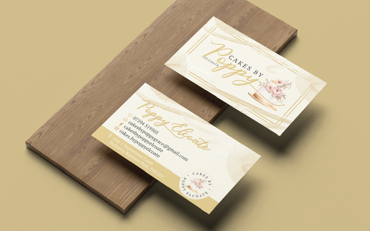
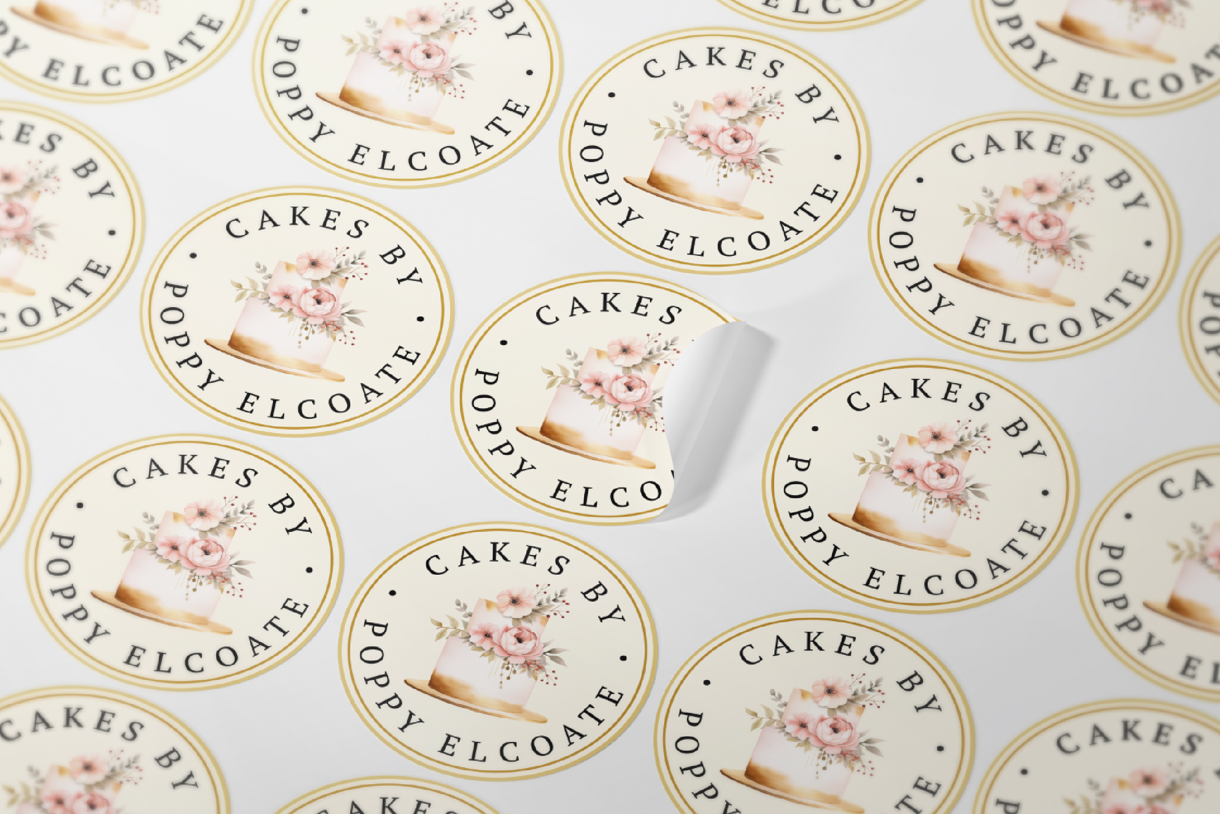
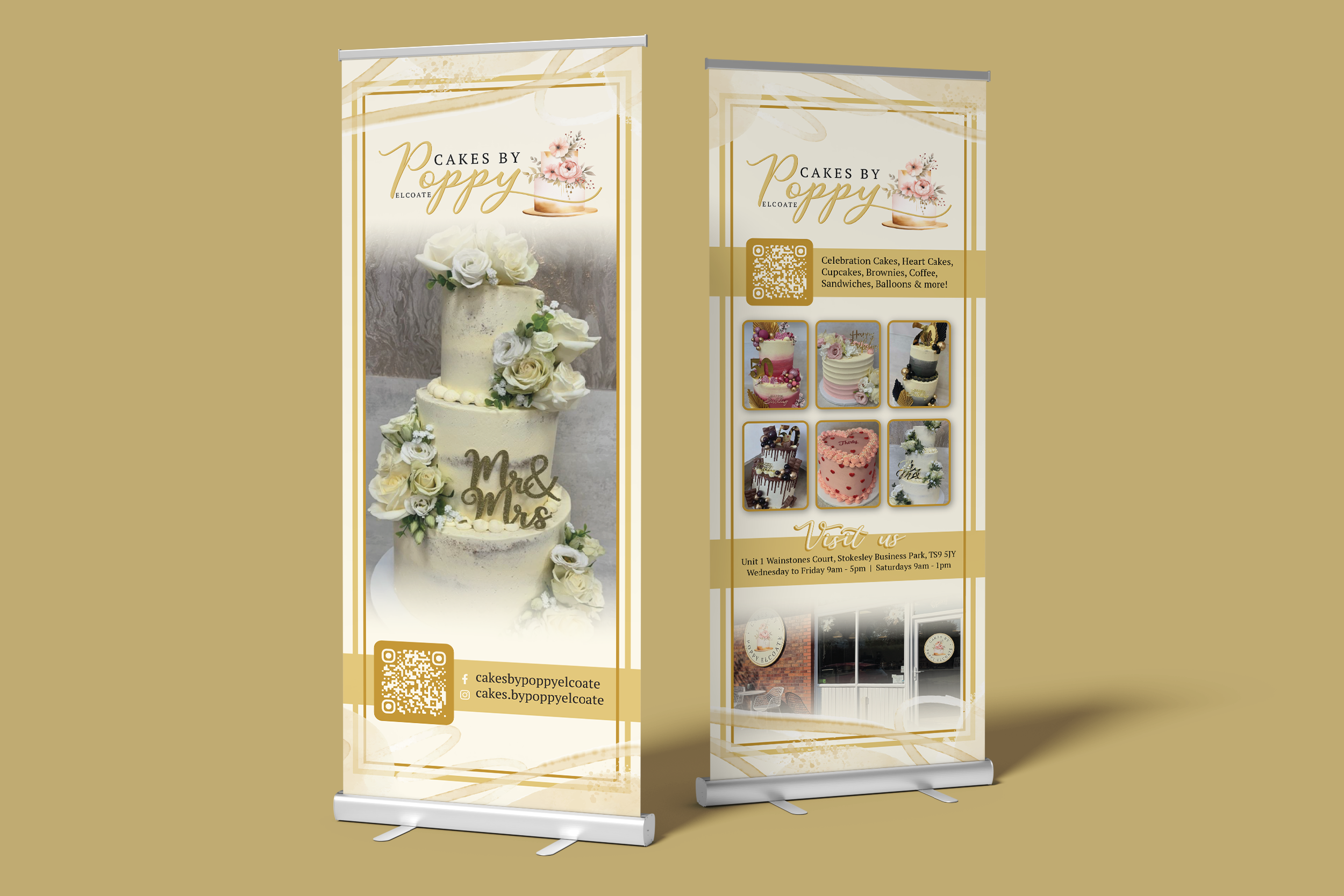
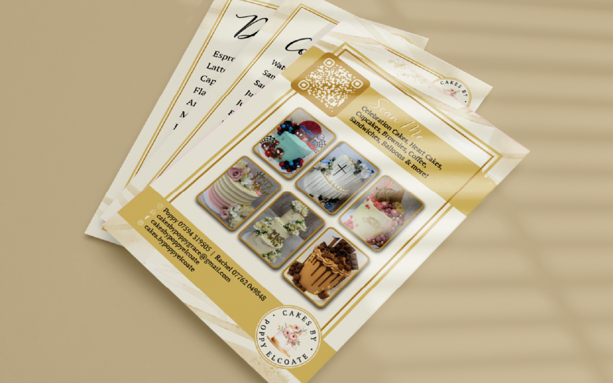
I worked with Cakes by Poppy to create a logo that could work across all the different shapes and spaces her business needed - from social media profiles to packaging and everything in between.
Once the logo was in place, we expanded the design across a variety of materials, including business cards, in-store posters to advertise her services, menus, signage and stickers.
The goal was to create a consistent, recognisable brand that could be applied easily across everything Poppy needed, helping her business look polished, professional and, most importantly, as sweet as her cakes!
“Alice was fantastic at designing my logo. Communication was great and she understood exactly what I wanted. The end result was perfect and I have had several compliments on my logo, posters, price lists and signage. I would 100% recommend Alice, she was a pleasure to work with”
Brierley Homes
Helping new builds look as good on paper as they do in real life
I’ve worked with Brierley Homes on a variety of design projects, supporting them across both print and on-site materials.
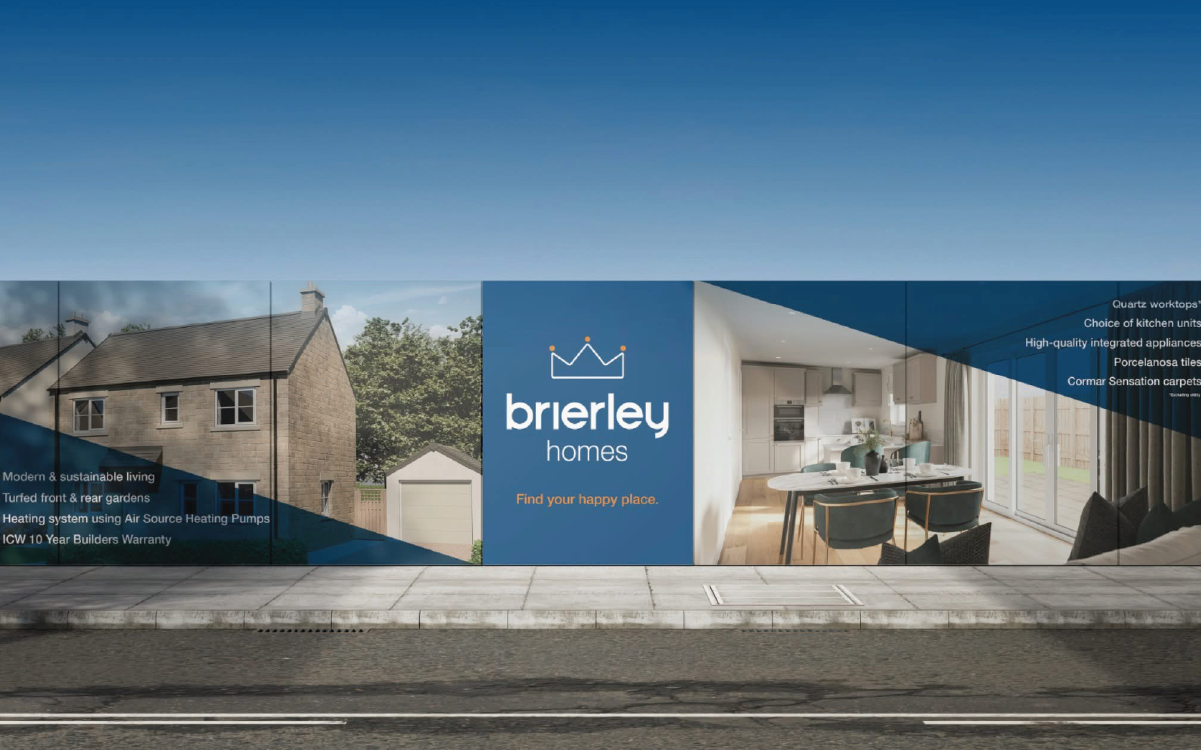
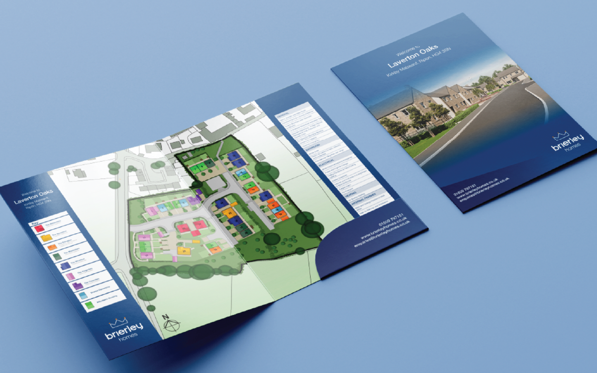
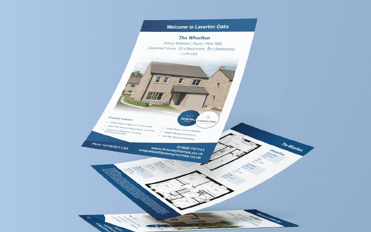
This has included hoarding designs for new build sites, folders for prospective buyers with inserts detailing each house type, and floor plans and site maps that could be used across signage and print materials.
The goal has been to create clear, professional, and engaging design that makes it easy for buyers to explore new homes - while keeping the Brierley Homes brand consistent across every touchpoint.
“Alice at Pink Designs has been amazing to work with. She completely understood what we were looking for and delivered some brilliant hoarding designs and logos that really reflect Brierley Homes as a brand. Creative, reliable and very easy to work with. Highly recommend!”
Foster Sounds
Turning vibes into visuals
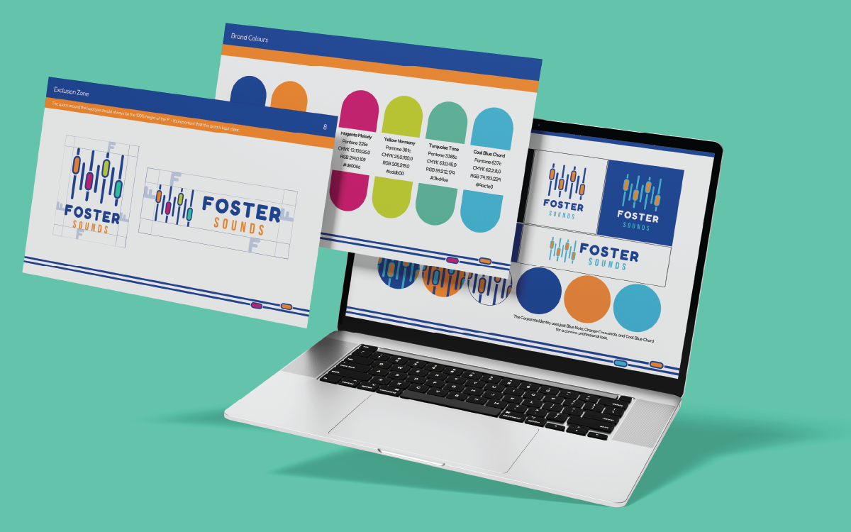
I worked with Foster Sounds, an independent music producer, to create a full branding package that would set them apart. Starting with a logo and a clear set of brand guidelines, the aim was to give the brand a strong, cohesive identity that could be applied across all touchpoints.
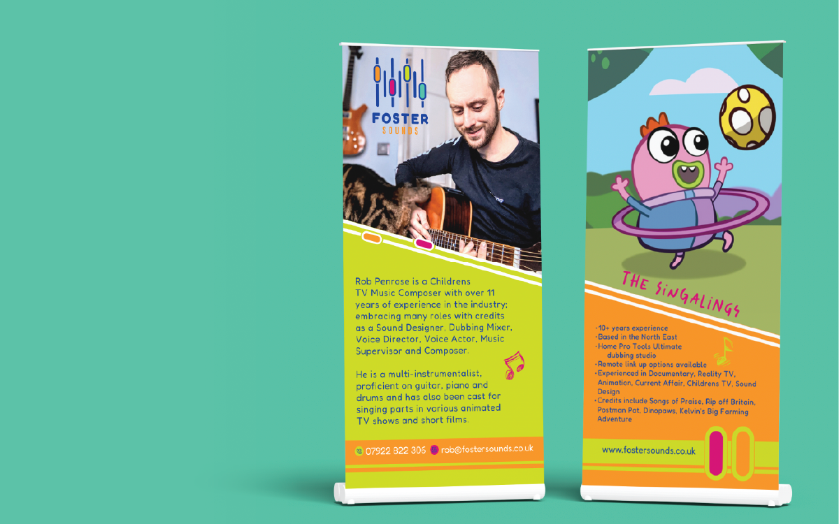
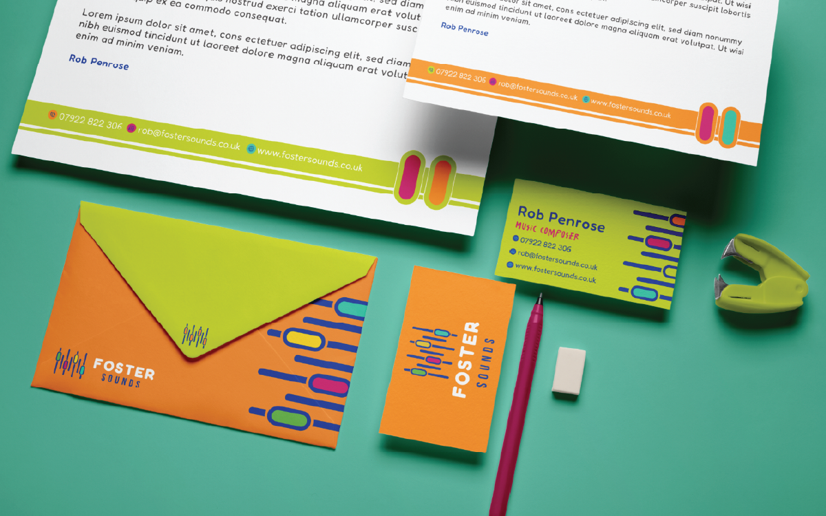
From there, we expanded the design into a variety of mockups and marketing materials, including business cards, pull-up banners, and email signatures. The goal was to make sure every piece felt consistent, professional, and ready to impress — whether it was online, in-person, or on the go.
Working on Foster Sounds was a great way to flex some creative design muscles, bringing a sense of personality and energy to the brand while keeping everything cohesive and practical.